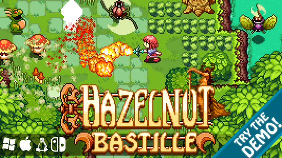
Hazelnut Bastille is a topdown, Zelda-like ARPG, presented in a rigorously-period 16 bit style.
Hazelnut is available to back again for a limited time. Our expectation is for orders to be charged when Dawnthorn, the 8-bit sister game to Hazelnut is first released to backers.
Latest Updates from Our Project:
Hazelnut Bastille Overworld Design, Part The Second
about 5 years ago
– Tue, Jun 15, 2021 at 01:14:51 AM
Ok, so here is the second part of what will likely end up being 6-7 updates focused nearly exclusively on the overworld for HB (since it is a rather large and involved task that has a massive number of facets to its design and implentation).
Recall that at the schematic design phase, the plan for the overworld was laid out something like this:
Over the course of actually planning out each room and the inter-relationships between each of them, it now looks like this, with maybe 60% of the theoretical playspace planned out in detail so far:
The major pieces of land which were added this month were the Village proper, and several adjacent annex spaces which are connected to it for storytelling purposes, as well as the midlands forest, the marshes, and their connections to adjacent future regions. You can see that some things changed from the schematic to the detailed planning stage (as expected). Most of the same rooms are still there, but they changed in scale in proportion to one another, as the original schematic was never planned to be at exact proportional scale. A couple rooms were eliminated because they ended up being redundant filler when other rooms took up functions they were intended for. The borders of the rooms are tending toward more regularity, with multiple rooms aligning to straight lines in their adjacencies... this is also a natural effect to emerge because it's the simplest way to address the problem of the camera anchoring at room edges being off at certain kinds of T-junctions as a consequence of how it functions.
An entire region to the east of the village was basically eliminated because I found it to be redundant with the western region after it was implemented, and would have just served to bloat the map in scale unnecessarily, when we actually need to be doing the opposite. The current scale places the finished map to be 250% to 300% the scale of one of the Link to the Past maps. While this is probably fine, and about right in the sense that LTTP had two of these overworld maps, and our map has a bit more negative space taken up by solid items than LTTP had, we don't want the map getting so large that it is impossible to navigate and recall the separate spaces, or that key points the player is supposed to recall for later are too far apart, or too many to be noteworthy.
Here is how the map currently lays out in terms of cell planning. Each of the smallest cells is 9x7 pixels, as that is the smallest unit we are working with. A single screen is 2x2 cells (so 18x14 pixels, corresponding to 18x14 tiles).
I ended up spending a bit more time on the midlands forest region than others, as a result of the complex transitionary position it occupies. It needs to serve as a passageway to basically every other region on the map, and provide various access points to them when appropriate at various points in the game. It needed to be fairly straightforward to navigate, but also have features that made it fairly challenging to pass through earliest in the game. It has many shortcuts that open up as the player acquires various items, that transform it from a massively circuitous journey, into being a pass-through region later on.
You should also be able to see the three altars of Hippopotamia which are located in a triangle around the currently finished map, which serve as fast-travel points about a third-way into the game and beyond. There should ultimatly be 3-4 more in the finished map.
Part of what makes this map design so challenging is the great many features it needs to balance at once. These fit into both aesthetic and mechanical elements, as well as constraints which are tied to how our game world is programmed and scripted.
Part of what makes this task so slow, is that we must address around 20 separate concerns all at once with every room designed:
Region borders, music transitions: Individual regions are planned to have their own individual musical tracks, which means that every time the player crosses the borders, the track changes. This means that places where it is possible to transit between regions need to be placed somewhat far apart, or the player will be changing musical themes too often, or too rapidly. Some regions like the midlands forest need to connect multiple other regions, but these points must too be placed a fair distance apart, so this also create a minimum thickness scale for these regions as well.
Points of interest: The map should be full of unique moments which the player is encouraged to recall later... places they can see but not reach, with some enticing visual draw to them.
Frequency of secrets and events: So too must the density of these locations be high, becase the further apart they are, the less content the map will feel like it has, and the more of an open wasteland it will resemble. There are loose rules about open-world design which state that the player should have their attention diverted from the task at hand every 30-40 seconds or so by something in their environment, which helps to keep them engaged, and not feel like they are simply grinding through legs of a shopping list of tasks.
Room transitions, avoiding transits within 7-9 tiles of a T-junction: This is a problem we have to contend with which is unique to the form of camera anchoring we are using, which is common to a lot of other overhead games, and some side-scrolling panning games as well. Basically it doesn't arise when rooms meet in a "four corners" pattern, but only when the border of one room strikes the border of another in a T-junction. This happens because the camera in the room they are about to enter would be anchored off the center of the screen, but it's currently anchored there now in the present room. We simply need to avoid letting the player transit within 7 tiles vertically, or 9 tiles horizontally within such a junction.
Avoiding passing under the GUI: This is one that is hard to notice, since when a game map is designed well, it doesn't ever happen, but one which we have to be careful to remember when designing the corners of rooms.
Sense of place: Each individual room should have a distinct character as a sub-type of the region it belongs to, giving it a sense of identity, and making it distinct in the memory of the player as well. For instance, the midlands forest region is made up of subregions such as the overgrown acropolis, a section of interconnected room-like spaces in a larger space, a loose "jungle"-scape, a court plaza space, ruined terraces, a meandering river, a reflecting pool, a dense maze, and a marsh section.
Rooms as proper spaces, rather than corridors: This is another one which is hard to grapple with. Regions are designed first as a collection of places which need to be linked up; I find this helpful because it allows me to give each one its own sense of place and identity first. A consequence of this approach is that the rooms that link them tend to read as corridors without any sense of place of their own, which is fine in some cases, but often there are alternate configurations that disguise this transitional nature they have.
Sense of history, acretional development: Thematically, the map tells a story of its history; it was settled at various times by 5-6 different races of people at different points in its timeline, and each left their own distinct marks; in some cases building on the work of those they found when they arrived, even even reusing their same materials, as happened at the village site, where the settlers built their homes on the foundations of a previously abandoned ruined city.
Ease of navigation, recalling spaces: The map should be laid out in such a way that it is possible to become lost, but also recognizable paths and roadmarkers should be present which help the player to visually navigate. It should not be a densely coiled mass of mazes, but it should also not be a straight shot, or a situation where any room has an easy connection point to any other adjacent room, meaning they can easily cross the entire map without thinking about exactly how places connect.
Low resistance and high resistance paths: Within the same region, some spaces provide significantly lower resistance to being crossed, as a consequence of their geometry, the enemies placed, and how those enemies interact with the environment emergently. This is by design, to give the player paths by which they can easily cross or travel quickly, and others which feel more like dedicated local content. The player will also have access to many paths at once, but we can direct them to where they should be looking next based on where they are best equipped to handle the enemies and hazards.
Shortcuts and bypassed obstacles: When a player first reaches new regions, the paths they find they must take will be quite circuitous and laborious, meaning a new region presents the greatest amount of resistance earliest on. As they acquire more items and abilities, they are gradually allowed to circumvent having to redo these longer paths, and avoid some of the hazards, making those regions more of a pass-through experience on the way to their later content.
A sense of journey: The player has access to basically every region from the very start, but the latest ones will have incredibly overpowering enemies, and will have taken so long to reach early on that they will seldom be visited. There will be a sense of gradually unlocking more and more distant regions, which eventually culminates in the climax of the story at the last region.
Regions which must serve several stages of gameplay at once: As mentioned, most regions will host the player a many stages in their journey. This means they need content which continues to be engaging, even in late game. This is partially done through the placement of draws and secrets which the player can recall early on, and continually attempts to reach, but is unable to until the very end. Another aspect of designing around this need is placing enemies in such a way that they are managable early on, but even in late game, punish the player for attempting to ignore them.
Room flow, pathing: The way that individual rooms are subdesigned is also an important element in the greater layout of the map they contribute to. The clarity of the path in each room can obfuscate or dilineate the greater path through the region to which it belongs. Denying the player an access point to another room it is adjacent to can complicate the layout, and demand more of the player to navigate the map. On the other hand, doing this too often tends to produce the corridor-like effect spoken of above, so there is also a balance. There is also the opportunity for a kind of story-telling to take place in how rooms progress, such as the scaling of a stairway, navigation of a complex building, or negotiation of a complex geographic feature.
Enemy encounters, controlling enemy movement: Rooms are heavily shaped by the sorts of enemies that inhabit them, and giving the enemy or the player specific advantages as a result of combining the room geometry with their respective traits. The rooms also need logical choke points to restrict different enemies from passing into sub-sections of the room for which they are not intended.
Providing logical points for story progression to occur at: The village and the rooms just adjacent to it are heavily designed around hosting specific story moments, and placing these key points at logical places the player will pass at specific points in the story.
Placement of major region barriers: Large barriers which prevent the player from passing early on, but become porous later are quite helpful at defining region edges. Examples of these include the forest river and the tall forest wall to the north of the midlands.
Topography continuity: This is a particularly important consideration for us, given that the player can jump between different height levels with their parachute. This means that when they land, the game engine must assign them a new floor level which they occupy. When they enter a new room, the engine will know which layer to place them on, because that room will have floor numbers that correspond to the global system. An obvious consequence of this is that the floor levels must be globally continuous across the entire overworld, which means a continuity study which basically resembles a topographic lines survey has to be done for the entire overworld before the rooms are converted from plans into implemented game spaces.
Rewards for earliest exploration: The gameworld actually rewards the player for visiting as many locations as possible as early as possible, and finding new paths to hidden places, primarily in how quickly they are able to extend their hearts pool. Hearts in HB are planned to have many small divisions, perhaps as many as 10, and they will be able to complete a full new heart container by combining larger and smaller pieces from a special plant found all over the game world.
Fast travel placement which makes sense for various points in the game: These are particularly challening to place, because they like some of the previous elements, they need to serve the player at multiple points in their journey at once.
A good deal more effort was spent on the Village layout than any of the other rooms, to reflect the central importance this space has for the story, and with respect to all of the functions the space would need to fill at once. This space needs to: serve as the backdrop to several critical story moments; have a complexity to it that feels like it is both familiar, but also easy to get somewhat lost in (it seems fairly simple in layout, but when viewed at the level of single screens, it is easier to get lost); have navigation features that serve as aids in designing sequences for the two major minigames that take place within it; connect several key vignette spaces which tell the story of the village's past and it's present inhabitants, as well as its future; finally, it needs to convey visually a sense of tranisition into each of the adjacent regions, and suggest something of the character of those spaces (which also helps in navigating out of the village, since you have a sense for where you are departing to).
There there several thematically important locations in the village itself as well. The central unbroken vertical axis it has is both functional, and a hidden story-telling element in itself. The axis starts with the Cernunnos statue (from the title screen), which is actually where the player is ressurrected by the sword when they fail without having a waypoint, and is symbolic of the gifts and watchfulness of the natural world. The statue looks north, watching over the player over their entire journey; it also looks across the axis, a passage of a human life, which ultimately ends in the graveyard to the north. This small patch of graves isn't explained until the end of the story, but it's ever-present... the player passes it everytime they transit this main axis in the village, or pass between east and west from one side of the map to another. It's an instance of what was called Memento mori in previous times, placing life in context alongside the existence of death. Death overwhelmingly looms over the story of HB, and the characters repeatedly find connection to one another through death, in one way or another.
Hazelnut animations update
about 5 years ago
– Sat, May 08, 2021 at 12:09:58 AM
Ok, so today we have some animation work to show off from the sprite updates. At the time I counted the votes, around a week after asking, Type three seemed to be the dominant favorite, so that's the type I used as a guide for our full heroine animation update. It's probably what you will see in the finished game now, outside of minor changes.
Dawnthorn music update
Right now I am focusing my full efforts on Hazelnut, since I think people would like to see more progress there before we finish up and release Dawnthorn. Shannon is finishing up the last tracks for Dawnthorn, since she found it easier to do them mostly at once, without flipping back and forth between the two works. The two tracks we have to present today for Dawnthorn are the Finished prologue track, which accompanies a crawl at the beginning of the game, and a concept for the final dungeon track for that game.
Hazelnut Heroine Animation update
In between doing work on the Hazelnut overworld map, I did some studies on changes to make to the Heroine's animation set, and then implemented a full update set.
On the left there are the idle, walk, and run sprites without shield (every sprite on this page is without the shield here). The next colmns over are some different studies for the attack animation. Below those, we have item deployment animation, then vertical frames for the spear and whip items. The next column over we have running phase frames, then uder that more item deployment, and the horizontal frames for the spear and whip items. Next column we have animations for the flash move and finish, then hurt animations (which also donate some frames to the stagger following a run with no flash). Under these are the first half of the death sequence frames. The last couple columns have frames which are used for the spin attacks, and the anticipation / chargeup frames for those. Under that, we have frames for shield deployment, and to the right of those, in the group of twos, we have frames for a new technique we spoke about trying, which will allow the player to strafe in 4 directions while carrying the shield, in a sort of hop maneuver. Below that are the frames for using the clothing parachute, The remainder of the death sequence animations, and the animations for being shocked.
You can see a sampling of some of these animations here:
So here we have 4 sets of attacks meant to possibly replace the standard thrust as the primary move. They fall into two main categories; the first covers a roughly 180 wedge in front of the player, and most resembles the standard atack from LTTP. The second is more like a quarter circle, and feels a bit more like the standard attack from the gameboy Zelda titles. The main difference between the first three is how the swipes are animated, and how the attacks are timed (this gives a big impact on how they are perceived as key frames when the animation is played quickly.
An example the the LTTP-style attack can be seen in this clip:
An example of the last kind is seen in the final video on this update. I think my preference may go with the last kind, because its quarter circle attack forces the player to be conscious of what their attack will cover, and what it won't. It also gives them a weaker side (their shield side), which reflects how sword combat works irl, and is a feature of the character controller we could exploit for room design.
Animations Set
And finally, a scene which features a large number of these new aniamtions in situ:
Let us know of any feedback you have for us on the current animation set! The next media that we should bring should be images and video from the overworld map design process in progress, as first described in the last update. We also expect some new Hazelnut music somewhat soon.
High-Level overworld map design for Hazelnut
about 5 years ago
– Fri, Apr 30, 2021 at 04:03:12 AM
Hi everyone! This is the first of two updates (the other should roll out in just a day or two) to give you an overview into the process I am currently engaged in for Hazelnut. It's a pretty complex job, and isn't producing media that is pretty to look at at this schematic stage, but that should change as it progresses into its later stages.
I am doing the high-level design of the overworld sequence, and tying it back into previous high-level steps for the planing of Hazelnut. Here is a quick graphic, divided into 4 levels of granular resolution, to represent the 4 major stages of designing the overworld:
(Each of these steps refer to one of the four images above)
Level 1: Narrative design and game sequencing, gating(complete, long task)
In this task, I laid out the full sequence of Hazelnut's complete gameflow. This task involved sequencing every stage's high level design elements, including what items were found there, how the stage was reached, what conditions have to be met in order to reach that stage, what mechanical elements are at play in that stage, what possible orders stages may be visited in different segments of the game, the global conditions that need to be met in order to advance to the next play segment, and the narrative elements which take place in each stage.
Tied in at this level of design are the narrative elements that take place among the NPCs in each segment, and events that take place in the overworld, and the sequence of encounters and conditions that must transpire in order to move the logic tree forward through each episode. Also included at this level of design are opportunities to get involved in optional content, such as minigames and side-quests.
Narrative elements must be placed in such a way that the player has the option to skip some of that content, while being forced to see critical dialogues that advance the plot, and introduce specific details about characters they will need to understand in order to fully appreciate the story. Encounters are laid out in such a way that the next encounter takes place in a location either directly mentioned in dialogue, or indicated by real-time events. At gated narrative stages, other NPCs also provide clues for where to find the next critical encounter.
In this stage, the high-level gameplay goals and bullet points were converted into a schematic map which grounds the events in a design space. This stage has some complex goals, but it was possible to complete it somewhat quickly.
The concept of the overworld which emerged at this level is something like a mixture of the light and dark worlds from A Link to the Past, and some of the concepts from Super Metroid.
In A Link to the Past, the lightworld is effectively fully open from the start of the game. It is designed around a few origin nodes (castle, village) and a handful of circuits which offer low resistance, albeit a bit stronger as the player gets further from the origin. These circuits allow the player to travel to nearly every region from the start. Adjacent to the circuits are transition-spaces, which offer slightly higher resistance, and lead into terminal content. Generally terminal content is gated behind item checks. Part of the beauty of this approach is that since the player is able to navigate around most of the world, they constantly encounter "lure points" which are intended to grab their attention, presenting various problems with non-obvious solutions, that work themselves out over time (an example being the mute man from the desert vestibule space). The dark world in the same game, is more partioned, containing gates and stopgaps where the player must obtain various items in order to reach new spaces, or unlock shortcuts for completing a transit more quickly.
Super Metroid uses a system of soft, relatively-hard, and impenetrable gates. Soft gates involve difficulty jumps, that indicate where you should go when multiple routes are open, based on where the enemies and the environment provide the least resistance. Harder gates are generally environmental, and do not preclude visiting an area, but gradually wear the player down, such as the hot rooms in Norfair that open up more with the Varia suit. There can sometimes be rewards for sticking with it and visiting these areas earlier. Impenetrable gates in Super Metroid, such as gates requiring the super bombs, stop the player from progressing outright, and generally that game uses these to trap the player in smaller regions at various times, to limit their choices to a more managable set of options. Super Metroid somewhat bogs down when the game offers the player too many choices at once in later portions, especially since it is not immediately obvious where they should go next, without long stretches of wandering. This is made up for by the fact that Super Metroid also embeds backtracking secrets all over the map which become accesible around the same time, which gives the player something else to focus on while they are looking for their next goal.
As mentioned, we combined each of these approaches, and took elements that fit our use case, with LTTP's light world being the most recognizable precedent. My estimate is that our playable overworld will be around the same size as the light and dark worlds from LTTP combined, just a bit larger. This is based on the amount of content we need to concentrate into it, and from projectsions of the size of the already mapped regions. There is a path with relatively low resistance that takes the player all the way around our map, but it's long, and the player likely will not be able to fully traverse it without dying until the midgame. This path adjoins to several other circuits on the map which also take them past other landmarks. Overtime, shortcuts open up between the circuits which allow them access to quicker routes to more distant places. In adddition, there are also warp points at specific locations, where a special event can carry the player between 7-8 specific locations. Things are also laid out in such a way that even though the player has access to the surface of later game regions, they will not be able to progress far into them due to environmental blocks.
The player's intitial spawn point and natural semi-impassible barriers will also concentrate their early activities in one region (the and and red regions), which they will get to know well. This region itself also has a host of key locations which will be shown to the player countless times, but not accesible until gradual later increments. The gameplay loop the player is intended to experience when navigating the overworld is for them to have a goal in mind, but on the way to be distracted by a handful of unique events, or by investigating a peculiar site or two they pass on the way. This is a technique in open-world design known as the "30 second rule", which is that a player's attention should be redirected constantly to keep them engaged.
In addition to this, specific regions have specific goals in terms of which abilities and item uses they are intended to showcase, and this is heavily integrated into both the fine content, and points of gating and navigation.
Another concern at this level of design is something called "heatmap design", which is a concept relating to control over which routes and regions the player spends the majority of their time in. Care must be shown in laying out regions and goal points, such that the player doesn't simply replay the same routes constantly, or that the routes which they will naturally spend more time in contain more important content points.
All of these different design criteria are challenging to balance, and the result of completing this step will also change somewhat as the following steps are executed, mainly step 3. Specific deisgn problems tend to only present themselves when they are addressed in great detail as well, or even at the gameplay-testing stage.
Level 3: High level area design(in progress, long difficult task)
This is the stage of design which takes the largest amount of time, and is currently in progress. This is the level of granularity that corresponds to what is called "grayboxing" in game design. Maps for each room are drawn up in great detail, at the scale of one pixel per tile. This is effectively creating the map in the most real sense, and the future stages are basically just adding art to this 1:16 pixel representation. These maps read something like what in architecture we call a "Nolli Plan", which is positive-negative space diagram that indicates where a person can walk, and where there is solid built material. In our game design context, this level of granularity similarly directly implies what the collision maps will be.
At this level, the player's experience is being fully planned as well... what routes they have available to them, how much space or constriction they experience... how we direct their attention to the things they need to see.
This level of design also takes into account the regional character of each space, and attempts to tell a story about each location, integrating setpieces around which the play sequences transpire.
This level of design also has a number of technical challenges to address at once, on top of all of the other design constraints and needs. The room design for our entire game works on a cell-system. A single game screen is two cells wide, and two tall, so these cells are rectangular, given the 4:3 aspect ratio. Rooms can be any full discrete multiple of these cells, in either direction. So a room at the smallest is 2:2, but could also be 3:2, 2:3, 5:9, etc. A problem that this creates for us, that is sort of difficult to understand intuitively, and not immediately obvious to a lay person, is in camera anchoring. When we move the camera through a scene, when the player is greater than the full width of of a cell from the edge of a room in one dimension, the camera pans in that dimension, so the player is centered in the screen. When they reach an edge, and are less than the width of one cell from that edge, the camera stops panning in that dimension, so it does not pass over the edge of the room. This is a standard camera anchoring technique that has existed since at least the NES days. The challenge comes in when two rooms that are not the same width on the side they adjoin meet in a T-junction as a result. The camera needs to be kept at least a cell width from an edge when the player is transitioning rooms in this specific case, which also has an impact on where collision is placed in these conditions. We also place collision in such a way as to prevent the player from passing under the GUI too much.
It's a lot of very specific contraints which must all be respected at once.
Furthermore, you can notice that the results of step three in our example for the southwest region do not match their schematic borders exactly. This is partially a result of changes that were made during their fine design that required the borders to shift somewhat in order respect specific design issues.
Level 4: Room grayboxing, gameplay design testing(yet to be started, moderately long task)
This step should happen relatively quickly compared to step 3. Each pixel of the high level area design step is converted to a specfic art tile, but we don't add any details beyond those critical for collision and understanding the scene visually. We do gameplay-level design testing in this step, meaning the placement of enemies, events / secrets, collision, shortcuts, warp points, entry points, etc. Things are adjusted as far as the gameplay testing demands.
This is also a step that includes a lot of gameplay balancing. Debug states are created which represent each of the 9-10 or so gameplay segments, so that we can test the player's experience at each of their inteded power levels during this time, and fine tune things like the damage of various weapons, fine details about their use, mana costs, the various variables that govern enemies, etc.
This is the step where we would likely first involve the alpha-testers for Hazelnut.
Level 4-and-a-half: Art Pass, Art Polishing, gameplay refinement (yet to be started, somewhat quick task)
In this step, we finish up adding the fine details of game art in the editor. The graphic below explains these steps (some of them will have been completed during the previous step as well). Details like fine texture variations and animations are added in, that would have been inapprorpiate to add earlier, due to how volatile the rooms are while gameplay changes are informing their changes.
I will also likely do one final pass on each of the art tiles, seeing them now in situ. I believe the majority of them will not need further changes, but some will surely be updated. It will be a simple direct substitution of the tileart, which will then be updated into the maps automatically. I may also do something like reducing the total number of colors in these scenes, so that there is a greater palette unity across all of the assets of Hazelnut, but I've already done palette refinements in several increments already, so these likely will not need to be extensive.
Stay tuned for Part two of this update sometime in the next few days!
Let us know which of these variants of the final production sprites for the Hazelnut Bastille Heroine you prefer!
over 5 years ago
– Mon, Jan 18, 2021 at 01:35:23 AM
Ok, so the task I am engaged with right now is finishing out the remaining animation frames for new action states for the heroine. As part of this exercise, I spent a bit of time cleaning up the animation frames of the heroine so they were less noisy overall, and closer to the concept and portrait art then they had previously been, rendering features like her hairband, and how her mantle (parachute!) ultimately looks. While doing this step, I also took a couple days and sketched up an alternative way to render the heroine's lower torsos and animations, that was a bit more in keeping with the traditional chibi style you tend to see in these 3/4 topdown games, as in the Zelda series.
To start off, here are some alternative ways to finalize the heroine's sprites; some of them are changed very little from the previous state having the same style of legs, others have slightly different hairstyles or the more chibi character. Let me know what you think of these, and if there is one style variant you'd ultimately prefer to see for the finished production art. We could also combine front and back renderings from different rows for similar hairstyles:
To help better illustrate the differences, I have three of these rendered as idle and run frames, so you can guage the impact:
There are a few more subtle distinctions between these as well, such as the "bounciness" of their gait (the chibi is currently rendered as bouncier), and of course any variant can be given any hairstyle or other details. Another subtle distinction is that the chibi variants are rendered in 3/4 side profile for the side views, but they could be rendered as the original was too.
Give us your thoughts here!
A technical look at some recent animation work for Hazelnut
over 5 years ago
– Sun, Jan 10, 2021 at 03:09:07 AM
Ok, so here is a look at some work for a feature in Hazelnut that isn't quite done, but I figured folks might still have interest in.
At some point in the story, the heroine gains access to an entirely new form, a river otter. This form develops over time, gaining new abilities as the story progresses, some of which function similarly to how a dungeon item fits into the gameplay sequence in the classic zelda-like scheme. This form has a complete animation set now, more or less:
One unique challenge that this concept has had so far (which I forsaw going into it), is that in this artstyle, characters which concentrate their bodymass into a single tile animate far more smoothly, look way less awkward as they are turning, and look way more believable in collision. Although the heroine is much taller than a single tile, because we as humans naturally understand the human form, and that it occupies only the space under the shoulders, our brains easily understand that in perspective she still occupies one tile. So while otters are quite long in body, I am rendering her as quite pudgy and bulbous. This gives the added benefit that round and soft objects are a boon for classic animation principles, since they are subject to many of the techniques that better sell an animation, such as elasticity, reactive deformation, inertia, and follow-through.
The run cycle and ground-animations feel fairly successful so far, and is probably the closest of the animations to being complete.
I watched a number of videos of otters in motion to get a sense for how they actually propel themselves. The motion is actually fairly interesting, and a bit different from most other mammals, but shared between their closer relatives like ferrets and weasels, and maybe a variation on what dogs seem to do. The best example I was able to find was an animation study by user "Panimated Sonja" on Youtube and Tumblr (you can watch it here: https://www.youtube.com/watch?v=cH-SsWJfHec ). I capture the 10 frames they drew here, for a reference:
The things that I take away, are: the front legs and back legs coordinate mainly as like-pairs, with a staggered action that probably creates more stability; there is a big contraction of the long spine, which generates a large amount of the force propelling the otter; the way the motion seems to work is that the back legs hop forward as the spine is contracting, and simultaneously the front legs leave the ground, the back legs push forward strongly, the spine straightens out, pushing the front of the body further still, and then the front legs make staggered contact, and provide the friction to plant the front of the body as the back prepares to repeat the motion. The back legs appear like they are responsible for about 2/3 of the power the four legs provide. I used these concepts as a guideline for my run cycle (the last 5 frames of each row):
The standing pose the otter takes at idle was suggested by a friend, and is a useful device that reinforces the idea that the body mass occupies a single tile. The transition between running and idle also seems to capture the active and somewhat nervous energy that otters have. Because the otter spends most of its frames with the majority of its body mass concentrated in a single frame, it ultimately seems to animate pretty gracefully while on the ground.
The primary purpose of the otter on the ground from a design standpoint is to use the burrow ability we have planned for it as a major feature, although it's not yet clear if the otter should have an attack on top of this- that may either end up serving to make the form more viable as a character controller, or it may also end up muddying the purpose and feel of the otter. The form is intended to feel quite different from the heroine's standard form, missing most of her abilities, but also to have enough utility that it is the best fit for some situations. The moveset must walk the line between utility, but also having it's own distinct experience, and not being redundant with her other abilities.
Another challenge to giving the otter a direct attack is that her body doesn't really lend itself to explaining how an attack with enough range to be viable could be delivered. The current idea, if we gave her that attack, would be for her to propel herself in a lunge, and roll it off as a ball. A rough look at that motion can also be seen in the ground preview video from last week:
It's likely I'd balance the utility of a roll attack with a few recovery frames that give vulnerability, since she is not meant to have the same combat potential as the heroine's primary form.
The swimming motion has been another highlight of the effort. The way that otters swim is just marvelous, but they are so dynamic that it is hard to immediately understand what they are doing. They are constantly twisting and rolling and flexing different parts of their bodies. User Airin Zhang on Youtube captures that pretty well in their animation:
I wasn't really able to parse what was going on until I saw a video of otters at the Milwaukee County Zoo exhibit underwater behind glass, which pretty much provides the only real way to see what they are actually doing in profile (you can watch that video here, where I timestamped it at the moment I captured: https://youtu.be/mXjE6-Fb53Q?t=99 ). Around 1:40, you can see what seems to be a perfect (rare) example of them using their primary propulsion technique while not turning at the same time. I captured the frames here:
From what I can tell, they seem to use their front legs similarly to how dolphins do- they keep them back to reduce drag, but temporarily lift one or the other in order to steer. Similarly to planes, their primary turning method involves roll rather than yaw, probably beause of the eccentric force their front legs apply against their center of mass. Here though the otter moves without using its front legs at all for a couple cycles. The energy seems to be divided between the otter's tail and their back legs. Otters actually have a broad, paddle-like tail to facilitate this motion. It's not clear if the tail or the back legs provide the majority of the energy. The cycle looks like the otter is creating an S-motion along their spine, and ending the motion through their tail, generating force on both the downward and upward motion. They slowly hook their back legs foward, and then increase their surface area with the webbing, and deploy a back-paddle, flattening them back out against their body. Then after a few cycles of this to generate power, they simple glide through the motion, sometimes adjusting course. Here is my current work to capture those motions:
Everytime the otter turns in real life, it is accompanied by a roll, so I also have the otter roll every time she turns.
Similarly to the ground form, it's not clear to what extent the otter should have attacks while swimming, but I did give her an animation for a tentative thrusting-roll attack to test. Most of her use is meant to be utility, navigating underwater spaces and manipulating event assets down there, while swimming away from hazards, and trying not to drown. Our intenion for that gameplay takes a nod from the Mermaid fins from the Gameboy Zeldas, where the underwater space is divided into multiple tiers where the player can change levels. The otter will be able to manipate objects by moving them with bubbles, most likely as well.
The art is of course just prototype placeholder for tiles, so don't focus on that.
So far the motion feels sort of successful, but not yet ideal. The animations are a bit longer than the other ground animations, which feels somewhat hard to avoid, since otters are such a long-bodied animal, and the straighten their bodies completely for this motion. But if she is too long, than she will feel very unwieldy to turn. The turning motion will make her feel like a javelin making 90 degree turns on its center of mass, and over-emphasize the 4-way animation she has. As I finish work on that one, I will probably de-emphasize her length, and the frames that give the perception of her long body to address that issue. The roll she does on the other hand feels really natural to me, and seems to add livelieness and the idiosyncratic character that the motions of otters have. I may shorten her body length in the roll as well, to minimize the current awkwardness of turning.
Here she she is during surface swimming btw, similarly unfinished, but getting there (the scene she is swimming in is technically shallow water by our game logic, but just use imagination for now, lol):
Otters aren't particularly known for digging, but they do burrow. In the animation, she basically does a shoveling motion with her forelimbs, making downard progress with each cycle. In the surfacing animation, she does a triumphant hop and dismount, which has to happen quickly so it feels responsive and not too control-laggy. I am thinking we might have the surfacing motion be a kind of attack that provides knockback, to reduce the difficulty of finding a suitable time and place to surface.
The utlity of the dig move is planned to be quite extensive, actually. The way it will function is that some surfaces like sand or grass will be diggable. Once she has burrowed, she will be in a new collision space entirely, to represent the unseen underground. She will run into hidden barriers down there, but also be able to dig under other barriers in the main surface playspace, like rocks or walls or cliffs. With enough experimenting, she will find new hidden paths. The ability will also allow her to circumvent some kinds of enemies. Additionally planned is the ability to manipulate some surface objects by mininig under them, and causing them to collapse into her mined path. The trail she leaves as she burrows will also have its own collision that some assets may respond to. Currenly planned to be prototyped for instance are puzzles which would involve creating a path of rails with her dug path for puzzle objects to be guided by. It is possible that some enemies will be blocked from crossing that path as well, but it's not clear if that particular feature will provide either interesting or broken gameplay, so we will have to prototype that concept as well to ultimately know.
We may have to play with the visuals a bit as well, in order to get the color not clashing with different environments, or for the path to look right when going under non-surfaceable terrain:
Part of the difficulty in prototyping this stuff is that simple ideas tend to have unforseen interactions with other existing features, and especially anytime you create a feature that involves collision as a major driving trait, you can expect something to interact in a funny way with it. Still, these features appear that they won't have too many special concerns in passing prototyping.
-----
If you have anything intesting to add about ideas for these animations, or design comments about the concept of the otter form as currently described here, let us know, since this part of the game is under construction and in the process of coalescing into its final form!